Posts

Showing posts from October, 2017

Web

Image
This is the website changed to a simpler and better looking website. I was trying implement a simple and realistic kind of design that was not over the top and could be attractive and likeable for customers and also relate the design towards my business which I complete some research online to help implement my idea but not fully. Reference JOSHUA, JOHNSON. 2011. 3 Rock Solid Website Layout Examples: Coded. [ONLINE] Available at: https://designshack.net/articles/css/3-rock-solid-website-layout-examples-coded/. [Accessed 24 January 2018]. Claudio Guglieri. 2017. 23 steps to the perfect website layout. [ONLINE] Available at: https://www.creativebloq.com/web-design/steps-perfect-website-layout-812625. [Accessed 24 January 2018].

Icon

Image
Also I change the icon colours to same colours of the logo and colour containers on the website to keep the website consistent and simple that would not put people off and too complicated for anybody. Reference ANDREW COLIN BECK. 2017. How To Create Effective Icons. [ONLINE] Available at: https://www.awwwards.com/how-to-create-effective-icons.html. [Accessed 25 January 2018]. KARA PERNICE. 2017. Bad Icons: How to Identify and Improve Them. [ONLINE] Available at: https://www.nngroup.com/articles/bad-icons/. [Accessed 25 January 2018].

Menu

Image
This shows the menu which has a colour scheme matching the company and the logo to keep it consistent throughout the whole process. I added text to the menu bar which I adapted a simpler and greener colour for the menu bar to look attractive and simplistic. Reference Stoney deGeyter. 2012. 6 Easy Ways To Improve Your Site’s Navigation. [ONLINE] Available at: https://searchengineland.com/6-easy-way-to-improve-your-sites-navigation-132138. [Accessed 23 January 2018]. Benj Arriola. 2017. How to Improve Your Website Navigation: 7 Essential Best Practices. [ONLINE] Available at: https://www.searchenginejournal.com/website-navigation-best-practices/192261/. [Accessed 23 January 2018].

Logo

Image
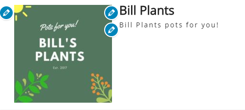
This is the logo which is simple colour scheme with icon of a plant in the logo to represent the company/business. I used a website to create my logo and it allow my to play around with the colour scheme, add images which I would fine appropriate to the company but I couldn't add all the features I wanted due to the limited space of a logo as I wanted to keep the image simple and not over complicated. Also, I used vector images of flowers and plants plus the sun to link it towards my business and make sure it was appropriate and suitable for the customer. Morr, Kelly. 2015. Logo colors: what’s best for your brand?. [ONLINE] Available at: https://99designs.co.uk/blog/tips-en-gb/logo-color-meanings/. [Accessed 22 January 2018]. Creative Bloq. 2014. How to choose a colour scheme for your logo design. [ONLINE] Available at: https://www.creativebloq.com/branding/choose-colour-logo-design-8133973. [Accessed 24 January 2018].

Colours

Image
This shows the colour wheel that have the colours for the website which I have chosen. I used the internet to explore different website to bew to choose the colour scheme of the website but was  not able to implement all the colour scheme ideas into the website. Reference Thomas Cannon. 2012. An Introduction to Color Theory for Web Designers. [ONLINE] Available at: https://webdesign.tutsplus.com/articles/an-introduction-to-color-theory-for-web-designers--webdesign-1437. [Accessed 25 January 2018]. Cameron Chapman. 2010. Color Theory for Designers: How To Create Your Own Color Schemes. [ONLINE] Available at: https://www.smashingmagazine.com/2010/02/color-theory-for-designer-part-3-creating-your-own-color-palettes/. [Accessed 24 January 2018].